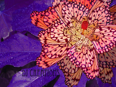
I was inspired by the Art Nouveau movement.
The Leafs of the Flower are wing of butterfly's
All the pictures I used are my original pictures
I might have gone a little crazy with the colors, but I was inspired by the Art Nouveau Movement. Especially in this period, lots of natural elements and bright vibrant colors are used. I try to make it look like a Kaleidoscope, but still look like a flower.
I love the option to work with the color in every layer, versa changing total Image to one color as in the previous lesson. Changing by layer, was a tedious process, but the outcome was worth it. A lot of the actions was copy, rotate, resize, place and change hue saturation.
I saved 3 Images to PSD to work on in the project.
Back Ground: Big Leaf taken in my back yard (180ppi)
Flower petals: Butterfly Image from the Zoo (72ppi)
Center of flower: Orange flower Image Golden Gate Botanic Garden (180ppi)
Finished Pies DJ CREATIONS (Resolution 72 pixels/inch) Saved in .jpg
After erasing some of the back ground around the butterfly wing, I selected the wing with the very handy magnetic lasso tool, and moved it onto the back ground (Leaf with water drops).
This way is easy to clean up the image without having to do it twice.
Under edit-transform I select rotate, and drag the corners of the boxes to the desired position, and enter when done.
This I repeated several times and placed the wings around with the base of the wing in the same area, until the Big petals went around. After resizing “Scale” and Skew the wing, I went around again with 2 different wider smaller sizes.
At last I placed the center of the flower. Image was RGB, I only had to change Hue Saturation.
I changed the back ground, to a dark deep color, for the popping flower color to stand out.
To get the best color possible, I changed the (Hue, Saturation, Light) by each layer, some petals are in the shade, so I made them darker. The petals on the top lighter.
No comments:
Post a Comment