Tuesday, July 21, 2009

Hooping on the roof of Seattle


Lisa Hooping: Light Practice and Pen Tool selection
HW 9 Selecting Image with a Pen Tool
This tool is so much better than the Lasso Tool.
I selected Lisa and her hoop with the Pen tool, as in your very good explainable video, I was able to make a very crisp and clean selection. The only difference is going back and forward from the Path tab, to the Layer tab to execute the selection before dragging the image to the new back ground.
Lisa did her performance in a club, but the back ground leaves a much desired for.
However the performance was in San Francisco, the only City picture I have is Seattle.
I created a glass shelf for her to stand on, like I have seen in very big City clubs.
I can’t wait to show this to Lisa.

WILD HORSE


Creating and Formatting Text Graphic (HW6 Part2)
I just love having so many options, blending, mixing and matching, a very artistic friendly environment.
With out the history backup, I would not be able to do this again.
Image: WILD HORSE
On the banner is my Text Practice:
D J Creations

Havesmiles.blogspot.com
PART 3: Define the following terms:
ascender- Letter that are above the Base line.
Descender- Descenders on characters such as Below Baseline Letters: (Y) (P) (g) extend down below the baseline while curved letters such as (C) or (0) extend ever so slightly below the baseline. The baseline is the point from which other elements of type are measured including X-height and Leading.

san serif- Modern type Example
serif- Little extensions of the letter, making it look like Calligraphy Hand writing
x-height, Raised Letter (X)
baseline- The line where the letters sit on, Example bottom of the (P) belly, it has to do with measurement, space in between letters and row height.
weight- Weight in Type, most typefaces contain bold and bold italic typestyles which are much heavier in stroke weight.

stress- Vertical stress (O) (O)
Diagonal Stress (O) (o)

stem- Example first vertical line in an (N)Answer the following questions:i) What does the term 'typeface' mean? Font Family
Typeface are specific letterform design of an alphabet, with characteristics that differentiate it from any other design.
ii) Give an example of a light weight font and a heavy font that you have on your system (not from the website).
One example of light weight font on my personal Lap top is: light weight
One example of heavy font on my personal Lap top is: heavy font
iii) What is the difference between a font and a type family. Give an example.
the phys­i­cal embod­i­ment of a col­lec­tion of let­ters, num­bers, sym­bols, etc. (whether it’s a case of metal pieces or a com­puter file) is a font. When refer­ring to the design of the col­lec­tion (the way it looks) you call it a typeface.
iv) Write one paragraph about Johann Gutenburg and his contribution to the printed word.
A True Renaissance man Johannes Gutenberg was the first European to use movable-type printing, and he created the mechanical printing press. The mechanical printing press is one of the most important inventions every made. The way of mass production of books before Gutenberg’s invention, was wood block copying. After Gutenberg invention was made and used, the production of books, development in science, arts, and religion took off. The movable printing press also allowed more everyday people to print their own ideas and spread them, without being too expensive. Movable print changed our world, in many ways like, advances in the arts, science, religion, and also the spread of personal beliefs. The Renaissance is all about the rebirth from the Dark Ages, and with Gutenberg’s printing press new ideas and individual beliefs were allowed to spread like wild fire throughout Europe, and change Europe forever. People, like Martin Luther, could write about their beliefs and get them out, even though the church controlled most people’s actions, people could revolt and rebel and be different.
v) Why is a 'modern' typeface not an appropriate font for the web?
It is reader friendly.
vi) Why is Baskerville considered a readable typeface? What characteristic (one of the type terms from above) specifically makes it legible?
Serif types are generally considered MORE readableInclude the answers as text in your email.PART 4:2. TYPOGRAPHY GRAPHICImage Requirements:Choose one typeface and one piece of text {haiku, part of a poem, lyrics, quote from a person, quote from a newspaper article or your own poem...} that will set the tone and theme for this graphic.
My Original Photography: Dog, Rope, Fence
Header typeface Mesquite Std:
Header: Dog B Gone
Theme: Animal Abuse Awareness
Tone: Outlaw style posting
Body Text typeface LilyUPC:
To some People a Pet is such a
special friend,
A friend in many ways.
Sharing love and companionship,
Just looking for your praise.
The clever things they often
do Bring a smile to your face.
To other People a Pet is
nothing but a material possession.
All that is left in this back yard,
are foot prints and the rope
the dog was tied to.
The Dog owner is charged,
with animal abuse and neglect.Use one background graphic, or create a composited image that supports and works with your text. Prepare your background using image editing skills we have previously covered. You may use original photographs, stock photography, a web graphic (provide a credit if you do).You may choose to try the filter techniques outlined in my video tutorials for this week or try a technique of your own. Work to integrate your text as a graphical element within the imagry. Establish a focal point in your graphic, and apply appropriate tracking, leading and choose a typeface and type treatment that aptly conveys your message. You may include a title for your text and who wrote it, or give credit in the email when you submit it.

The SUNNY SIDE OF LIFE MAGAZINE

Theme: The Sunny Side of Life ‘The ultimate health magazine
Home Work 9 Masking, using 2 layers

I think a really good selling magazine, needs to be very eye catching, Collors and visual elements are there for important. Collors need to match, and i choose a happy positive theme. I think with all the negativity, something uplifting, cheerfull and sunny might stand out, between all the other magazines.
I am focusing my magazine on positive Health stories, uplifting experiances, self help health, motivational quotes, tips, and awards.
The Title of the cover “The sunny side of life” Cover collor represents a mid summer ussue of the magazine, people are ingaged with out door activities, and enjoing the gardens. This makes it a visual hint, you can read this magazing while sitting in your back yard.
Magazine explanation: “The ultimate monthly Health magazine”
Cover story: step by step instructions how to loose weight while hooping, and how easy it is. “If you think hooping is not a work out, think again” included Lisa instructor picture with her hoop on the cover
Every month a new Quote will be printed on the cover, wanting to get the next magazine to see what the next quote might be.
Again, working in the silent hinh “Is Gardening considert a work out?”
people love pets, and love to read about wat they have to say about animales: “Kahealani Werner’s Story, how pets can benefit your mental health”
My opinion, a lot of people take Vitamins and are cirous what other people take how ofter and why: “How many vitamins do you take a day?
When you are done reading your magazine, you will get hungry, pictures of garden setting lunch, and how to make it funn for the whoe family, with tips how to make a quick bite, and it to be good for you to: “Healty Eating is Happy Eating, Have you had your fresh vegetables today. How to stay healthy with eating right!”
And as final, because Autism is a new hot topic, the award inning person who was selected, for being a upstanging citisen: “Exclusive interview with Louise Emerson, her 50 year aniversary working with Children with Autism”
The Back drop I created with my brush tools like the leaf pattern #74. The color Channels I picked with just using Red and Green, this gave me a popping bright yellow. Because of the bright color I kept the image very simple, and used one of my original gate picture of a Botanic garden in Belgium Antwerp, and this gave it some contrast.
The Picture is Lisa, my coworker who is a Hooping instructor, she inspired to do a heath magazine.

Surrealism "I'm Puzzled"


Theme: Surrealism I’m Puzzled
I find Surreal Imagery very interesting, my Image “I’m Puzzled” is one of my dreams I had a while ago. The longer I look at it the more I understand what it represents to me. As all art I believe you can find a meaning in an image, depending on your mood when looking at it, one day versa a other you might see something entirely different. In this Image I try to make the Kight with the puzzle pieces flying off it, to be my focal point. The Puzzle pieces have the image of my face reflection on it. The kight made of glass making it look very fragile, and leaving me feeling blown away, and coming apart. The tail of the kight has some of the shapes that I created with Photoshop Vector and pen tools. The wall below water is one of the elements that represents blocked paths in my life and actually painted the wall with acrylics and scanned it, to implement it into this art.
I think, all this is coming from being separated from my husband.

S U R R E A L IS M project:
Theme Self Image, What other don’t see what I see about myself, and How the mind is a puzze work of connecting peaces, that not neceserely fit together all the time.
Image requirements, Bitmap Graphict, Photographs, Scanned drawings, scanned, objectss, pen tool: to cut out my head


week 5: {June 29 - July 3}Lesson 11:Thursday, July 2MORE ESSENTIALS
HW 10 Surreal Image Requirements:Use a combination of bitmap graphics such as; photographs, scanned drawings, scanned small objects... and the pen tool to create a surreal image. Remember an important component in surreal imagry is a fantastical juxtaposition of subject matter. For example, a cow with wings flying over the moon, an airplane flying over a toaster :-)Try using some of the techniques demonstrated in the video tutorials. The piece can be photographic in nature, illustrative, or a mix. BUT THERE MUST BE EVIDENCE OF AT LEAST TWO VECTOR OBJECTS CREATED WITH THE PEN TOOL IN THIS GRAPHIC.
Save in jpeg format {file>save for web} and in the subject field of the email put your last name and first initial with the number of the homework.
Example: McIntosh J-HW10 surreal Please use this format for each assignment that you email me throughout the semester.

CRISTAL CLEAR


Theme: Cristal Clear
I used Pop Dots to create the light separation behind the text “GOD IS MY ROCK” Clipping mask to cut out text from the chandelier. I also used the clipping from a duplicate chandelier “CLEAR” to add the sky. The chandelier I found at Google Image and the Rock is a picture I took in Half Moon Bay, I created this Image for a friend of mine, she thought the rock looked like hands together.

Fruit Spa


Image Theme: Fruit Spa,
Blur adjustment entire Image with Luminance. Masks and Layers, The pink fountain image I used twice, but with different Blur options, to see the difference in creating depth without having shadows. All the images to create this art I down loaded from Google Image. The text is a clipping mask to separate the two words going slightly from dark to light. A lot of the detail parts, I resized, changed color, and used the screen option to make it see through. I came about creating this, a coworker’s child wanted a Punch Fountain Birth Day party. I created the invitation cards for the party.

BLUE FLOWER


Theme: Blue flower with orange butterfly’s flying into distance
McIntosh J-Homework 4 Photoshop
All the pictures I used are my original pictures
Blue Flower Picture Details: Butterfly Picture Details:
Date created 3/12/2006 2/20/2009
File Size 628 KB 1.49MB
Dimensions 1704X2272 2048X1536
Dimensions 9.5”X12.6” 28.4”X21.3”
Resolution 180ppi 72ppi
Bit Dept 8 8
Color RGB RGB
Color Profile sRGB IEC61966-2.1 sRGB IEC61966-2.1
Camera PowerShot A520 Digital Other Digital
Exposure Mode Auto Auto
Focal Length 23.2 mm 46.7 mm

I chose 7 pictures for this project.
I used the blue flower for the back ground and several pictures of butterfly’s in different positions. I user some of the pictures twice, and used the arbitrary rotation to get them in the position I wanted. I also resized the butterfly’s to make it look like some are flying away in the distance, by using image size. I rather work with the percent than inches, by changing the amount in the Document Size width percent, I will be able to resize all my butterfly’s in different sizes. I’m absolutely in love with the Magnetic lasso tool, I use this function to wrap around the butterfly with some back ground still attached. After moving the butterfly over on the back ground, selected Inverse, than “holding down the Shift Key”, I am still able to move my butterfly around and place it in the right spot. It still looks a bit messy, because part of the back ground is still attached, but by zooming in by 200, I am able to go around the edges and clean it up with the erase tool. I can choose the size of the erase tool, to quickly get rid of big chunks, or with the small size, get into little corners. I kept the edges very sharp, for the end result to look like the butterfly’s are flying of the monitor, and it gives it a 3D effect.

Finished piece Image details:
File Name (Blue Flower With Butterfly’s.psd)
170x2272
22.89 MB
180 ppi
RGB/sRGB

Monday, July 6, 2009

Animal Abuse Awareness


Working with Photoshop Vectors:


I just love the diversity of so many options, like blending, mixing, and matching. I find it a very artistic friendly environment.


Advantage

1. It gives nice clean edges

2. With using text, it makes it better readable

3. Able to mix shapes or letters with back ground texture

Change letters hue, saturation and brightness (HSB)


Joan of Arc Photoshop Mid-term-proposal


My Theme:

The collage graphic is about a short biography of Joan of Arc, her real Name "Jehanne d'Arc" she was considered a Hero and a Saint.


Photoshop tools I used:

The following tools are, Sopt healing, Image Crop, Magnetic and Polygonal Lasso, Ellipical Marquee, Horizontal Type, Magic wand, Move, Edit transform, Scale, Rotate, Shew, Distort, perspective, Wrap, Flip H and V.


Visual Theme:

Capture the courageous young woman in the middle agas.


Color Schemes:

I used Magenta as my overall color ny changing the image, adjustments and colorbalance for every layar. The corrections are made with adjusting the, shadow, midtones, and highlights.

Friday, July 3, 2009

NIGHTLIFE IN FRANKFURT


Nightlife in Frankfurt
Theme 12B: Frankfurt Night Life, Focal Point Text Clipping and Drop shadow, Pen Selection Tool was used to past the Man in Drag in to the city see. I played with the colors of the city until I got this neon light effect.

Tuesday, June 30, 2009

HANDS UP

IT REPRESENTS THE POWER OF "HOPE-BELIEVE-LOVE"
Masking techniques with Adobe Photoshop.
This Image makes me feel so Happy.
HW 2 Theme: Hands –Masking with color range
McIntosh J-HW3
- Automatic Image Correction
- Adjusting brightness levels
- Correction with curves
- Compensating for flash and back light
Homework Photoshop
Duotones have become very popular for illustrations in glossy magazines and in advertising. Duotones color mode in Adobe’s Photoshop uses an imaging process that calculates the highlights and middle in a black and white image, then allows the user to choose any color ink as a second color.
Duotones come from Cyanotype color images in newspapers and comic books and are usually halftone prints and occasionally duotones. Duotone is the generic name for multitone printing, which can be done with two, three or four inks. This process requires that the press be set up with special inks; usually Pan tone designated colors, instead of the standard CMYK inks used for process color printing.
True multi tones use spot color plates, rather than dithered CMYK, but a good emulation can be done using the much cheaper and more available CMYK printing process.
It seems odd to me that with such beautiful color images that we want to convert the image to black and white or duotone. It is essential for a good quality duotone to start off with an image that has a good overall tonal range and contrast. By converting a color image to gray scale, and using the duotone option, by selecting one additional color from the commonly used colors other than black, you will be off to a great economical start.
If you are interested in printing the image, make sure to keep the cost in mind. Cost is depending on quantity of colors used in the image, availability of Ink color, and paper. Enhancing the image with curves can have quite a bit off effect on the finished piece, depending on the image. All these factors determine the best end result you are trying to achieve.
A flat diagonal line will print both colors at the same gray value with an even color range, sometimes this is best, but it will load up in the dense areas, and flatten the highlight area’s. Depending on the changes of curve % highlights, you could manipulate the amount of ink coverage in the deep shadows of the image, you would set a lower percentage of ink in the box labeled “100%”, so, if you are printing black and one additional color you may want to reduce the amount of color in the deep shadows because it does little good there. In the same respect you may want less black in the highlight areas since the combination of black and color increases ink density anyway. So you would possibly set a lower percentage in the 5 and 10 Boxes.
Info found at:
Duotones by D’Lynn Waldron, PHD
Graphic-design.com/Photoshop/duotones/index
Wikipedia

Donnaly Ainsworth

I McIntosh J-Homework 3 Photoshop

Wow, im in love with photoshop.
The PlantCore Photo is my original
The Drop of Watter for Duotone Photo is from photo stock online

I used the Bridge to select my pictures and saved them as PSD files.
I used the history brush, for cleaning up the brown spots on the green leaves.
Select watter drop with oval Ellipical Marquee tool, and dragged it on the green leaves.
For the watter parts:
The layars Icon menue, Drop down to select layer style - Inner Shadow
- Inner Glow
- Screen (in blend mode)
- watter layer blend to 255
- underlying layer: to 163 (for some leaf edges to come out the watter)
Saved it in PSD file formatt
Now the Duotone part of the project:
- Desaturate (Gray scale) convert- Image adjustment

Monday, June 29, 2009

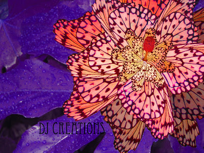
Colydescope Flower


I was inspired by the Art Nouveau movement.
The Leafs of the Flower are wing of butterfly's
All the pictures I used are my original pictures
I might have gone a little crazy with the colors, but I was inspired by the Art Nouveau Movement. Especially in this period, lots of natural elements and bright vibrant colors are used. I try to make it look like a Kaleidoscope, but still look like a flower.
I love the option to work with the color in every layer, versa changing total Image to one color as in the previous lesson. Changing by layer, was a tedious process, but the outcome was worth it. A lot of the actions was copy, rotate, resize, place and change hue saturation.
I saved 3 Images to PSD to work on in the project.
Back Ground: Big Leaf taken in my back yard (180ppi)
Flower petals: Butterfly Image from the Zoo (72ppi)
Center of flower: Orange flower Image Golden Gate Botanic Garden (180ppi)
Finished Pies DJ CREATIONS (Resolution 72 pixels/inch) Saved in .jpg
After erasing some of the back ground around the butterfly wing, I selected the wing with the very handy magnetic lasso tool, and moved it onto the back ground (Leaf with water drops).
This way is easy to clean up the image without having to do it twice.
Under edit-transform I select rotate, and drag the corners of the boxes to the desired position, and enter when done.
This I repeated several times and placed the wings around with the base of the wing in the same area, until the Big petals went around. After resizing “Scale” and Skew the wing, I went around again with 2 different wider smaller sizes.
At last I placed the center of the flower. Image was RGB, I only had to change Hue Saturation.
I changed the back ground, to a dark deep color, for the popping flower color to stand out.
To get the best color possible, I changed the (Hue, Saturation, Light) by each layer, some petals are in the shade, so I made them darker. The petals on the top lighter.